Chapter 48 Figures
The way in which to visualise your data requires another book on the topic, as there are a myriad of decisions to make on all sorts of topics. What I provide below is a very brief start to thinking about these topics. If you need to explore more of the world of data visualisation, I suggest that you read books on this topic. Happily, people like Kieran Healy (2018), Jack Dougherty and Ilya Ilyankou (2021) and Claus Wilke (2019) have each written such books. Claus points out that while there are ways in which you can go wrong when plotting data (such as drawing lines to infer relationships that are not there), the skills in data visualisation are more in the aesthetic and interpretive environment of what tools to use that make the data easiest to interpret. How will the figure enhance understanding of the data and respond to your hypotheses?
Note that the principal software used for drawing data in Dougherty & Ilyankou’s, Kieran’s and Claus’s books is R (see part 1), and the many packages that have been developed for use within the R environment (R Core Team, 2021). The distinct advantages that this produces are the almost limitless additions and details that you can make to these figures to produce exactly what you want, in a vector format. The drawback is that you might need to invest some time to learn how the graphics package works, and how to manipulate it to do what you want.
I agree with the approach of Dougherty and Ilyankou (2021) who suggest that you start any figure by mapping out what you want to convey and how. Sketch this out and discuss it with your advisor.
48.1 Graphs
You should be aware of all the things that make up a good graph already. Here I’m going to provide some extra pointers on what I think is important and should be considered when drawing a good graph:
- Labels. This seems completely obvious and yet it is a common problem with submitted papers. Axes should be labelled with both an explanation and the units in which they were measured.
- Capitals. Be consistent in capitalising labels and other words in your figure. Avoid using just capitals (e.g. ALL CAPITALS ARE DIFFICULT TO READ AND UNSIGHTLY)
- The scale. Make sure that the numbers of the scale are large enough to read even when the figure is reduced the size that it will be printed on the page. This includes the text that crossed the axes.
- If you have used a log scale, make sure that this is prominently labelled.
- Data points. I am a great fan of including all the data points that go to make up any summary statistic that is displayed on the graph. Thus, if you provide a mean or something like a box plot for your x-axis category, then please add all data points as well. This can be done using the jitter function in R.
- Don’t draw relationships that aren’t there. The ease of plotting graphs makes it possible to display relationships between data points that don’t exist. This is most commonly done across a set of discrete measurements when a continuous line links them without any data to suggest this relationship. Be especially careful when plotting lines that you can infer a continuous value between points plotted.
- Compiling graphs. If you have a series of graphs that share the same x- or y-axis then consider compiling them together. This essentially turns them into a composite figure, but it often means that readers can compare data easily from one graph to another. Remember that you will have to make sure that the scales on the shared access are all the same.
- Use consistent symbols and colours throughout your thesis. Your thesis will likely plot data on similar variables in many ways throughout. By using consistent symbols (e.g. circles for females and triangles for males) and colours throughout the thesis for the variables that chapters have in common, you will help your reader understand a figure much more quickly. The consistency of the graphical environment of a thesis will facilitate understanding.
- Consistency is especially important across panels within a composite figure.
- Colour. The reason for all the fuss about not having colour in figures is mostly to do with the extra cost involved in printing them. Typically these days, it is possible to use colour in figures and for these to be reproduced without any extra charge online. Thus if the data that you have is best shown with colour then use colour. There are some things to be mindful of when using colour.
- Colour blindness: This affects quite a large portion of the population, particularly men. To avoid using colours that can be easily confused simply look them up.
- Printing colour in monochrome: some people still like to print out papers in order to read them, annotate them or share them at a journal club. Using a monochrome printer many colours are indistinguishable. You can therefore change the hue or intensity of a colour to make sure that it can be distinguished when it is printed.
- Aesthetic quality: some colours don’t go well together. A lot of people have already determined this and you can find a good guide here.
48.2 Maps
There are many reasons why you might need to include a map in your paper when writing for biological sciences. I find that the easiest way of creating Maps is to use GIS software like QGIS or ArcGIS. Both of these require a good degree of learning in order to master. To have a map with sampling points is relatively straight forward. Especially with QGIS you can watch ‘how to’ videos on the internet to learn most of what you need to know. Things to remember when you’re drawing a map:
- If your map is a detailed view of an area then consider a small context map in the corner showing where your area is
- Include the scale
- Provide a North arrow especially if you have rotated the view
- Some journals require a specific mention of the geographic projection see here, or to provide a citation for each layer of the map (which makes sense when you think about it). Thus it’s a good policy to make sure you know the provenance of the layers that you are using.
- When using colour see these handy sets of colours to use at Colorbrewer.
- Make sure that any points you have included are big enough so that you can see the point and the shape of a point when the figure is reduced
- Strictly speaking maps in figures should not have embedded legends (keys). The correct way to explain symbols is to do it in the figure legend. However, sometimes if there are many different symbols it is more expedient to use an embedded legend.
48.2.1 Maximising the content of your figure
Sometimes you will have the option of including more information in a figure than the original plan that you started with. This is perhaps especially true when it comes to producing maps with GIS because you have the option of adding extra data layers. But remember that this information should not be gratuitous. In Figure 48.1, we can see a map that shows a number of sampling sites. The map has a scale bar and north arrow as needed.
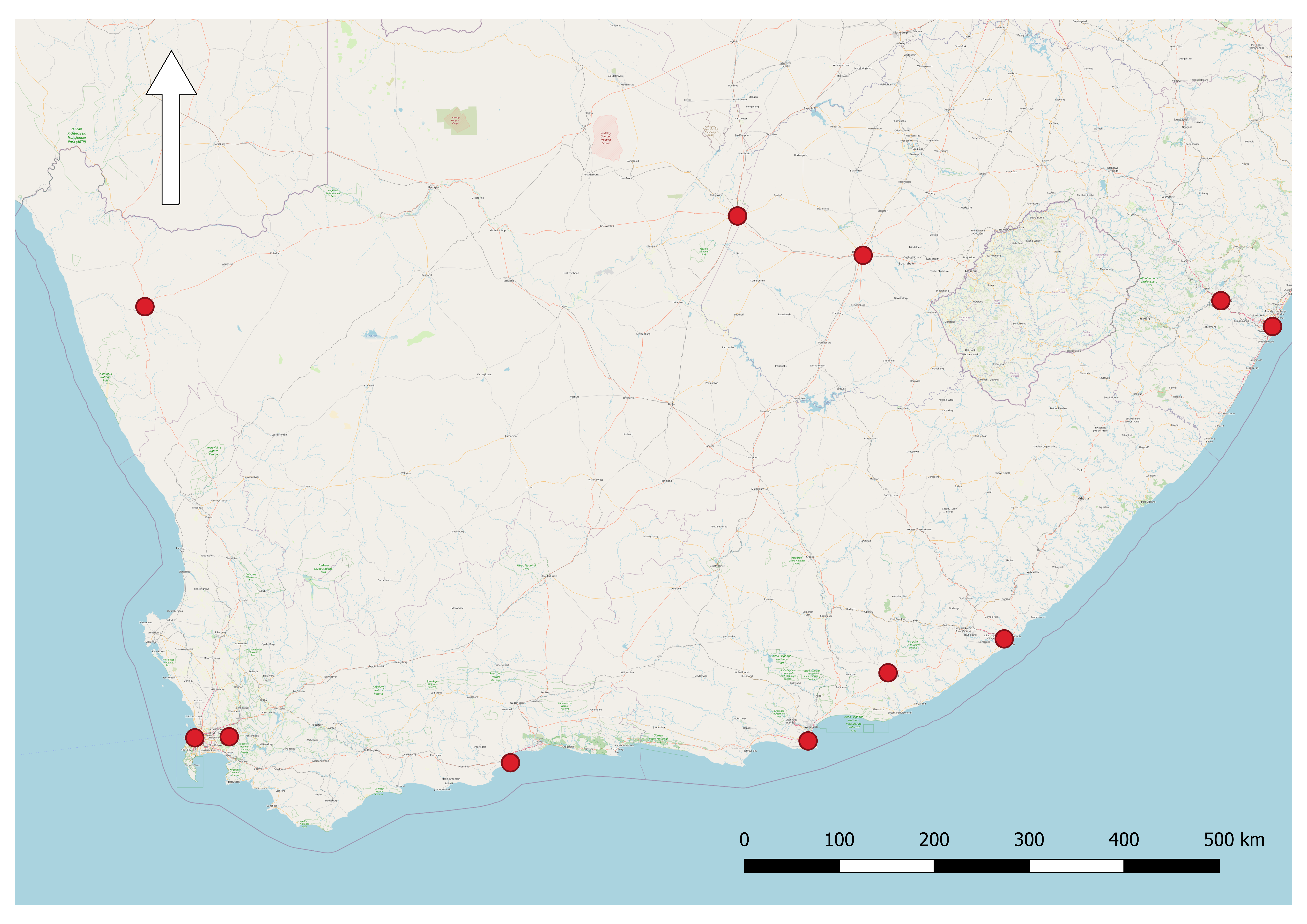
FIGURE 48.1: A plain map can give all the information needed. This map adequately shows the positions of sample sites (or anything else) as red points within the southern African region.
However, it is relatively simple to add more information to this map in the form of layers. In Figure 48.2, a digital elevation model (DEM) allows us to see the relative elevation at the sampling points, while transparent colours provide information about the different biomes in which the samples were made. Lastly, I’ve used a piece of sea to insert an image of the species sampled. There is also a reference map (top left) showing the area of southern Africa where the sampling points occur. This figure is now much more informative, and has greater aesthetic appeal to me, but all of this added information is only of use if relevant to the manuscript or chapter.
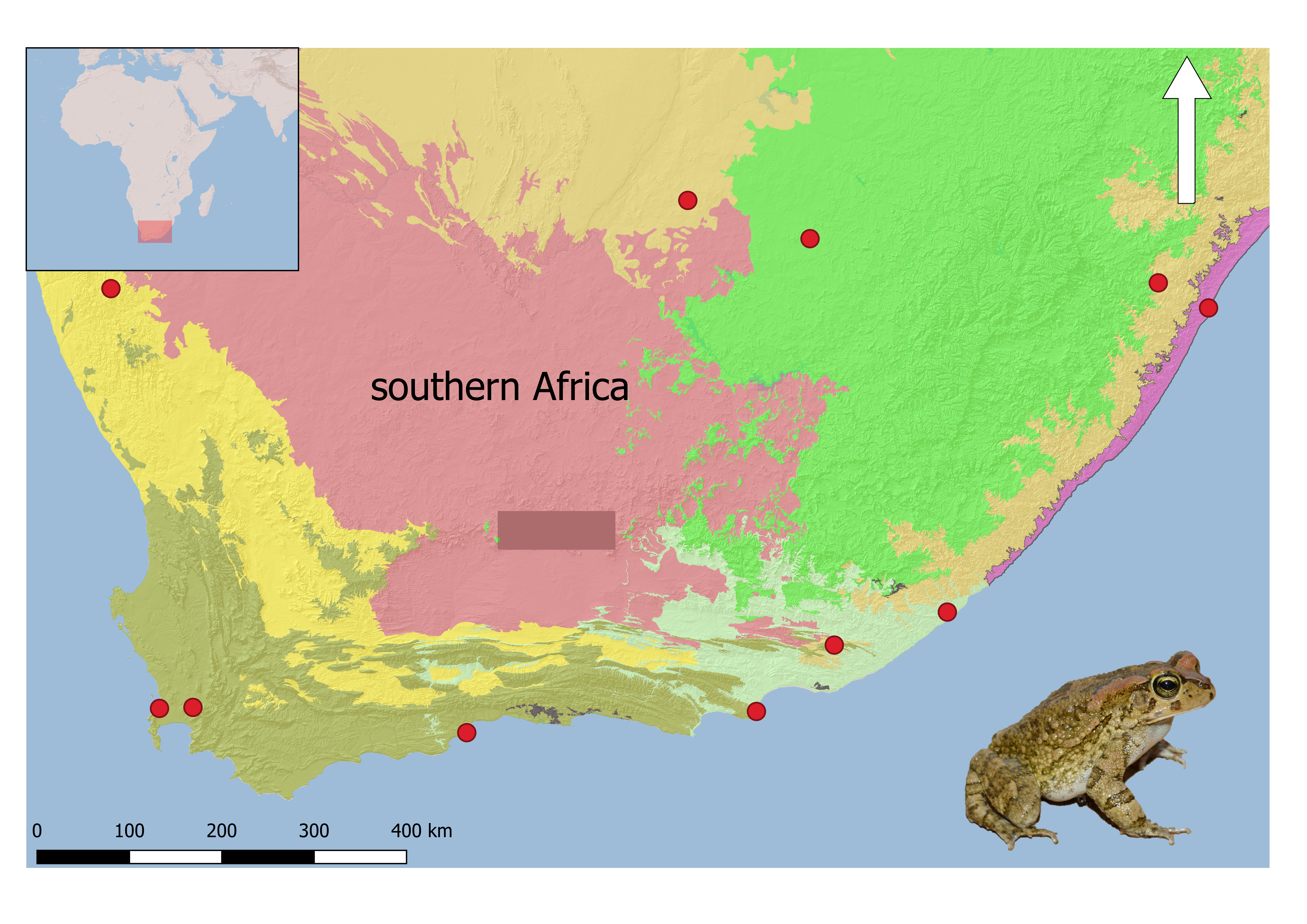
FIGURE 48.2: Maps tend to have a lot of space, and GIS provides the opportunity to add layers to give rich information, as well as improving aesthetics. This map shows lots more information about the biomes in which each of the sample sites (red dots) falls, the elevation and an image of the species sampled. The inset of Africa (top left) shows the area sampled with a red square. I’ve also managed to fit in an image of the species sampled into the sea (bottom right).
48.3 Conceptual diagram
Conceptual diagrams or figures are very useful in the introduction or methods when you have undertaken a complex study design. There are many different ways of doing this, but essentially the information needs to be conveyed in a way that is more simple in the figure than writing it out. Boxes and arrows are sufficient for most purposes. If the figure gets too complicated to understand, it’s probably of little use.
I encourage my students to draw conceptual diagrams of how the thesis chapters relate to one another (Figure 51.1), and then to include this diagram in the introduction to the thesis to help examiners and any other readers to understand how the chapters are interrelated (see Part IV).
I suggest that it is also very useful when you’re undertaking a review to draw a conceptual diagram for yourself of what you were trying to achieve. This may or may not then be included in the review when it comes to publishing.
In order to make your conceptual diagram clear the following points should be followed:
- Keep any text in the diagram large enough so that when it is reduced to printing size it can still be read
- Try not to write full sentences but just notes
- Make use of arrows to show how ideas are related
- Look at other conceptual diagrams, especially those that resonate with you as a reader
48.4 The composite figure
For me, composite figures started when I noticed other papers were including small pictures of species in phylogenies. As a reader, I really liked this way of understanding more about the animals that were being studied. The composite figure also comes about by making use of blank spaces that naturally occur within figures. Many graphs have large white spaces toward the top (left or right), and small images of study animals, cartoons of study designs or systems can be inserted to improve the immediate recognition of what the figure is portraying.
48.4.1 Ideas for composite figures:
Include a picture of the subject species in a small corner of blank space in one of your figures. For example, maps with a large area of sea (if your subject is a terrestrial species) are especially good for this (see Figure 48.2).
48.5 Sending your graphics file to the publisher
One consistent problem is the lack of understanding that authors have for different file types. It can be rather confusing as these are stated in lots of different ways, and often in units that are not intuitive. Journals usually have long and detailed explanations of how to do this in their instructions to authors, yet this is one of the most common difficulties that authors have. I will provide a brief overview of the most common problems, but better overviews exist and I encourage you to read them (e.g. Wilke, 2019).
Be aware that the publisher won’t be able to change anything within your figure, like the fonts. This means that you will need to use the same font in your figures as stipulated by the journal (in the instructions to authors). You also need to be critical of the size of any fonts that you use so that they can be seen even if the figure is reduced to fit the page width, or half page width. Be especially careful of numbers on scales as well as labels.
Most publishers will require you to name the files of your figures to correspond with their instructions to authors. If they don’t have specific requirements, then use clear file names (e.g. Figure_1.png), and not cryptic ones. Remember that each figure needs a single file, so if you have produced a composite figure, then you will need to output this as a single graphics file. You will need to send them a generic file type (e.g. eps, jpg) and not something specific to the software that you used (e.g. ai, cdr).
Colour is usually free to produce online, but you may need to pay for printed production. Make sure that your figure makes sense in monochrome if you intend the colour to be online only.
48.5.1 Vectors vs bitmaps
The biggest difference among image types is the difference between vectors (a line drawn between two points) and bitmaps (using pixels to create images). Vector diagrams will produce superior images on screen that will allow you to zoom in without loss of resolution (e.g. svg, eps, pdf). With a bitmap, the more you zoom, the more you will be able to see the pixels that make up the figure. If at all possible, create your figures using vector graphics (such as in R or drawing software such as Adobe Illustrator), and store them in this format. The only exceptions will be images (e.g. png, jpg, tif, raw, gif, bmp) that you add to composite figures, insert these with the highest resolution available.
If your figure is a photograph (or another tonal image type), then it will have to be a bitmap. However, if you have a line drawing, try to get it output as a vector rather than a bitmap as not only will the quality be better, but your options for editing and improving will be greater (should the editor require this).
48.5.2 Sizing your figure
When you export your graphic from the graphics package that you are using to draw it, specify the resolution (most often in dpi: dots per inch) given by the publisher. Minimum resolution for photos and tone images is 400 dpi, and 600 dpi for line drawings. Remember that the dpi will change if the size of your figure changes. Hence you must know the printed size of your figure (in cm or inches) on the page. This is usually either one or two columns. Rarely, a journal might allow you to use landscape instead of portrait for a figure. As a rule, you should use the page setup in your package to specify the output size of your figure (page layout function) before you start, and then set the resolution before you export the figure. It’s always possible to draw at a higher resolution and convert to a lower resolution. Low-resolution images need to be redrawn to make them higher resolution.
If you are using R, you can specify your graphical output in your coding. If you are using a GUI (like R Studio), you can choose to export as an image (i.e. bitmap) or pdf (i.e. vector). R Studio will allow you to set a generic or custom page size before you save.
48.6 The figure legend
The most important point with the figure legend is that it should be a stand-alone explanation of what is in the figure. The reader should not have to refer to the text in order to understand what is in the figure. For example, if the figure is about a species then species name should be included in full. The explanation of any variables or categories needs to be provided. But it should not be taken to absurd levels, and is not a reason to repeat everything that’s in the materials and methods. Take a look at some figure legends that are already published in the journal that you are hoping to submit to and you should have a good idea of what to write. Figure legends need to be full, grammatically correct sentences.
Remember that the figure legend is placed underneath the embedded figure in your thesis. This means that the graphic itself should not have any title. Traditional submissions to journals require figure legends to be at the end of the manuscript, before the figures themselves. Many journals now allow you to embed a lower resolution image of the figure on first submission together with the legend underneath in order to facilitate peer review. Check on the requirements for your institution or journal before finalising this.
A trend with online journals is that each figure (and table) needs a topic or title sentence, followed by a description. This is a good way forward with any figure legend. Both need to be uploaded along with the image file when you submit the manuscript.